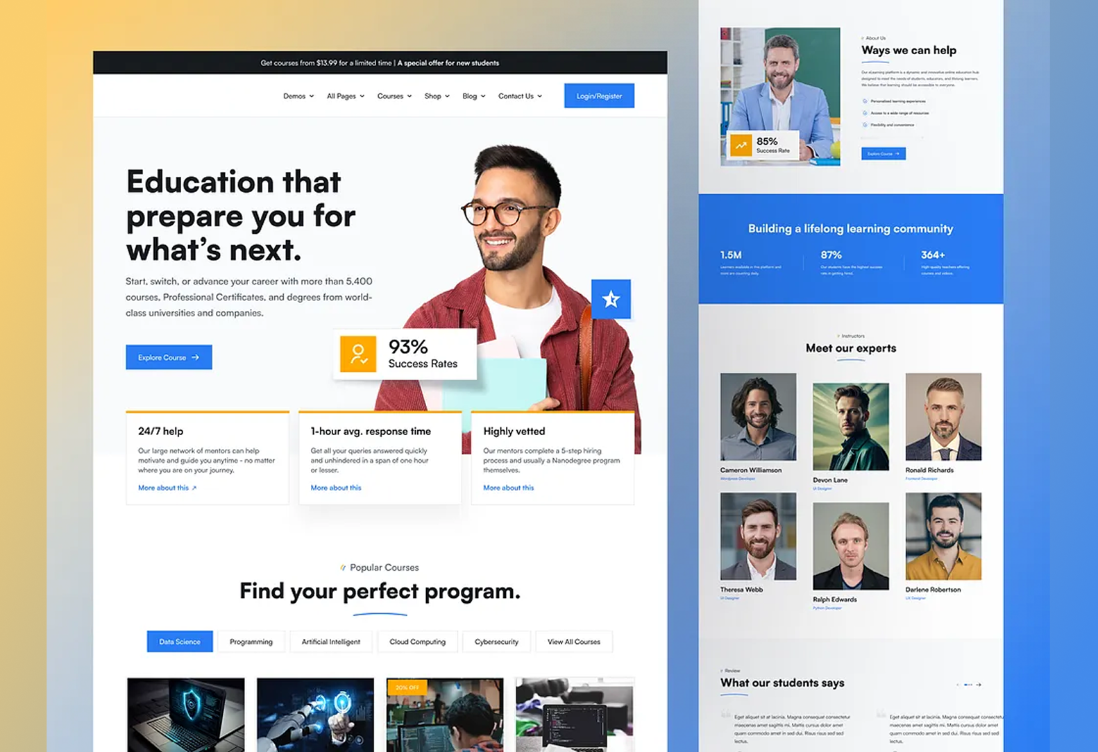
Despite the explosion of online learning, many education platforms continue to fall short when it comes to delivering personalized experiences. As explored in our previous blog, rigid architectures, limited integrations, and accessibility gaps have made it difficult to meet the diverse needs of modern learners. But the good news? These limitations aren’t unsolvable—they’re design and development challenges waiting to be addressed.
Designing for engagement goes far beyond sleek visuals or functional interfaces. It’s about creating learning environments that adapt, include, and inspire. In fact, studies show that students in engaging, well-designed digital environments are 2.6 times more likely to be academically motivated. This blog dives into how intentional design choices, flexible technologies, and accessibility-first thinking can radically enhance learning experiences—and why the shift starts with reimagining the website itself.
1. Embracing Flexible Web Architecture
Rigid templates can’t support evolving educational needs. Switching to flexible, modern architectures opens the door to more dynamic, personalized experiences.
- Custom Web Development
Purpose-built platforms allow organizations to align the tech with their pedagogical goals, learner personas, and content structures.
- Modular Design Systems
Enables teams to reuse and rearrange components quickly—ideal for scaling content or launching new programs.
- Headless CMS Implementation
Separates front-end and back-end layers, making it easier to deliver personalized, fast-loading content across devices and channels.
2. Designing with Learner-Centric UI/UX
An engaging learning experience starts with how users interact with content. Great UX can reduce friction and enhance focus.
- Simplified Navigation
Clear user flows, progress indicators, and intuitive menus help learners stay oriented and motivated.
- Adaptive Interfaces
Designs that adjust to individual preferences—such as dark mode, font resizing, or layout changes—enhance comfort and accessibility.
- Gamification & Micro-Interactions
Progress bars, quizzes, badges, and subtle animations make learning feel interactive and rewarding.
3. Accessibility as a Core Design Principle
Inclusive learning starts by removing barriers—and designing with accessibility in mind from the outset.
- WCAG 2.1+ Compliance
Ensures that content is perceivable, operable, and understandable by all users, including those with disabilities.
- Assistive Technology Support
Compatibility with screen readers, voice recognition, and keyboard-only navigation is critical for inclusive digital learning.
- Cognitive & Neurodiversity-Friendly Design
Use of plain language, visual cues, and consistent layouts helps learners with ADHD, dyslexia, and other cognitive differences.
4. Enabling Dynamic Content Personalization
Static content doesn’t work for diverse learners. Dynamic systems can adapt based on progress, preferences, and performance.
- Personalized Learning Paths
Learners can be guided based on goals, strengths, or learning speed—automatically or through user input.
- Data-Driven Content Delivery
Real-time feedback and behavior tracking power smarter content recommendations and interventions.
- CMS Upgrades for Flexibility
Moving to modern, API-first CMS platforms makes it easier to deliver adaptive, user-specific content across touchpoints.
5. Seamless Integration for Holistic Learning
A great learning experience often requires more than just a standalone site—it’s a connected ecosystem.
- LMS and Tool Integration
Unified access to content, assessments, discussion forums, and analytics creates a frictionless experience for both students and educators.
- Standardized APIs and Data Models
Open integrations enable cross-platform compatibility, easier updates, and richer insights.
- Unified Dashboards
Personalized dashboards for tracking progress, deadlines, and feedback make the experience more organized and actionable.
6. Prioritizing Performance and Accessibility at Scale
Great design falls flat without performance. Scalability ensures consistent user experience no matter the volume or location.
- Fast Load Times
Optimized images, clean code, and CDN use help ensure speed, especially on mobile or low-bandwidth connections.
- Mobile-First Development
With a large share of learners accessing content via smartphones, mobile responsiveness is non-negotiable.
- Cloud-Based Infrastructure
Supports high availability, performance consistency, and rapid content delivery across regions and devices.
Engaging education platforms don’t happen by accident—they’re built with intention. From architecture and accessibility to integrations and performance, every design decision shapes how effectively learners connect with content. By adopting a learner-first approach and modernizing the backend, educational websites can finally bridge the gap between digital convenience and meaningful learning.
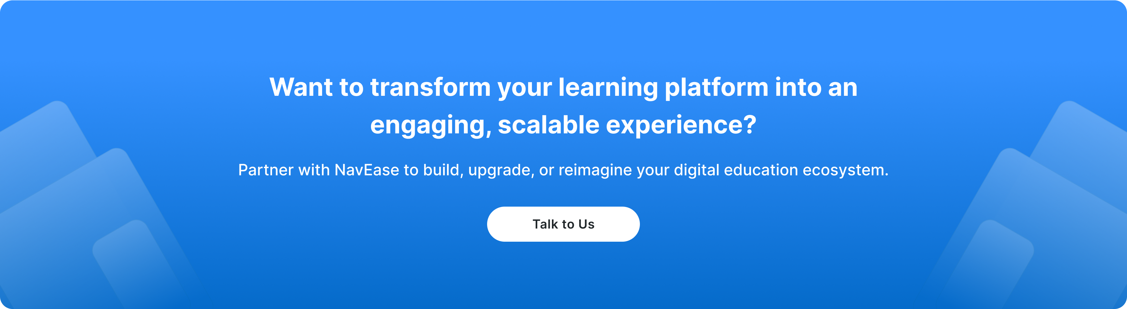
With NavEase’s WebVerse solutions, education providers can break free from outdated systems and build platforms that truly serve today’s learners. Whether it’s custom website development, CMS migration and upgrades, or adopting a headless CMS for future-ready flexibility, we equip institutions to design, deliver, and scale engaging learning experiences across the web.
Leave a Reply